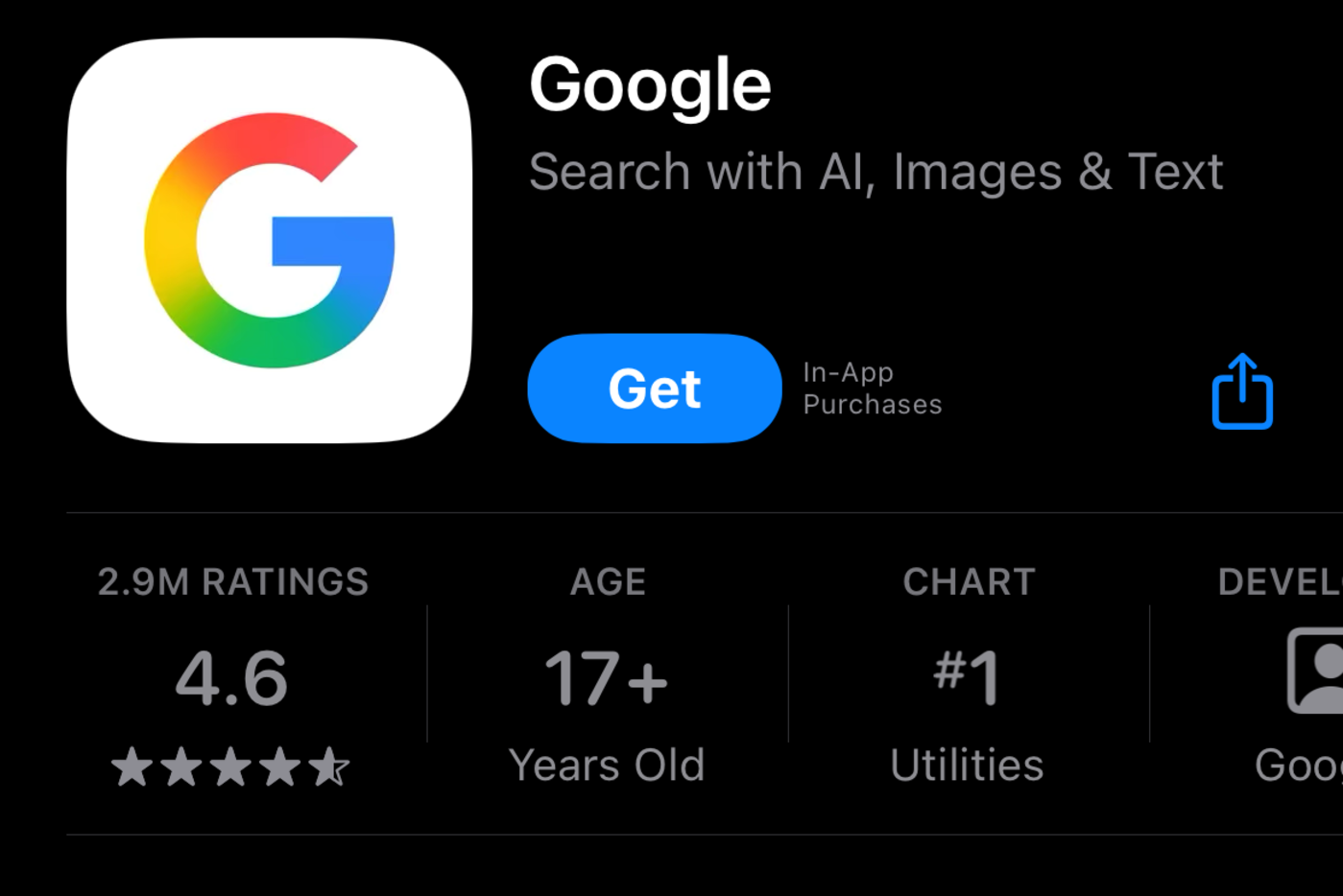
 Over the past few days, eagle-eyed Google users may have noticed that in some instances, the capital G logo for the company now sports a gradient softening the transitions between the four solid-color sections. The branding has been changed for the Google app on both Android and iOS devices as of this writing. However, there are still several places that continue to sport the classic color block look, including browser favicons. It's also not included in Google's official collection of images fo...
Over the past few days, eagle-eyed Google users may have noticed that in some instances, the capital G logo for the company now sports a gradient softening the transitions between the four solid-color sections. The branding has been changed for the Google app on both Android and iOS devices as of this writing. However, there are still several places that continue to sport the classic color block look, including browser favicons. It's also not included in Google's official collection of images fo...
Over the past few days, eagle-eyed Google users may have noticed that in some instances, the capital G logo for the company now sports a gradient softening the transitions between the four solid-color sections. The branding has been changed for the Google app on both Android and iOS devices as of this writing. However, there are still several places that continue to sport the classic color block look, including browser favicons. It's also not included in Google's official collection of images fo...
Share this Article
Recommended